Comparative Snapshot Of The Epidemiology Of Malaria And Cholera Between 2000 And 2016


Introduction:
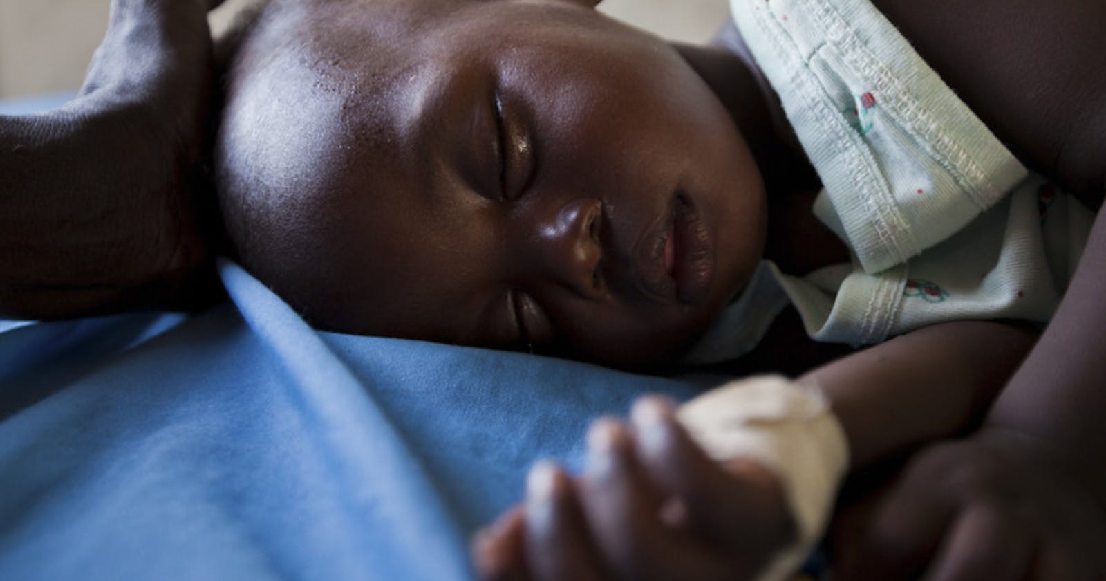
Did you know that a child dies from malaria every 2 minutes? Yes! Every 120 seconds!
According to World Health Statistics, Global life expectancy at birth is up from 66.8 years in 2000 to 73.3 years in 2019, with healthy life expectancy up from 58.3 to 63.7 years. This means that the world is healthier than it was 2 decades ago. However, some diseases still plague the world with Africa being at mercy of a number of diseases that may be a result of climate change, economic or other reasons not covered in this study.
Researchers have estimated that each year there are 1.3 to 4.0 million cases of cholera, and 21 000 to 143 000 deaths worldwide due to cholera. According to WHO, four African countries accounted for just over half of all malaria deaths worldwide: Nigeria (31.9%), the Democratic Republic of the Congo (13.2%), the United Republic of Tanzania (4.1%), and Mozambique (3.8%).
The above statistics do beg the question “Is the whole world altogether healthy or some are doing better than others?” This project seeks to answer this question by analyzing the world’s dataset on Malaria and Cholera for over one and a half-decade.
Data and Model:
Data Mining and Cleaning: The datasets covering 2000 to 2016 were retrieved from kaggle.com. The files were in Excel CSV format and it was imported to Power BI. Here, it was cleaned. A column was created to show the name of each disease on their worksheet.
Each worksheet was imported into power bi and was transformed on the power query. Unwanted columns and rows were removed. These were not needed for the analysis. The headers were formatted and "null" values were changed to “0”. ‘Append Query’ was used to combine the two tables after creating a uniform data set. The cleaned data was then loaded into PowerBI. After the data was loaded, a column was created to calculate the Mortality rate by using DAX and the Mortality rate was calculated as =Divide(Diseases[Number of Deaths], Diseases[Number of Cases]).
Data Visualization: The following steps were taken to visualize data, generate insights and create the Dashboard:
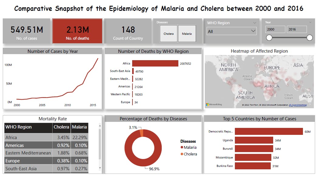
- Visualized the Total Number of Cases for both Diseases, the Total Number of Deaths for both Diseases, and Count of countries using cards.
- Filter for Diseases, WHO Region, and Year using slicers.
- The Number of Cases for both Diseases by Year using a line graph.
- The Number of Deaths for both Diseases by WHO Region using Bar Chart.
- The overview of Affected Regions using a Heat map.
- The Mortality rate of both Diseases by WHO Region using donut chart.
- The percentage of deaths by Diseases using a donut chart.
- Top 5 Countries by Number of Cases of both Diseases using Bar Chart.
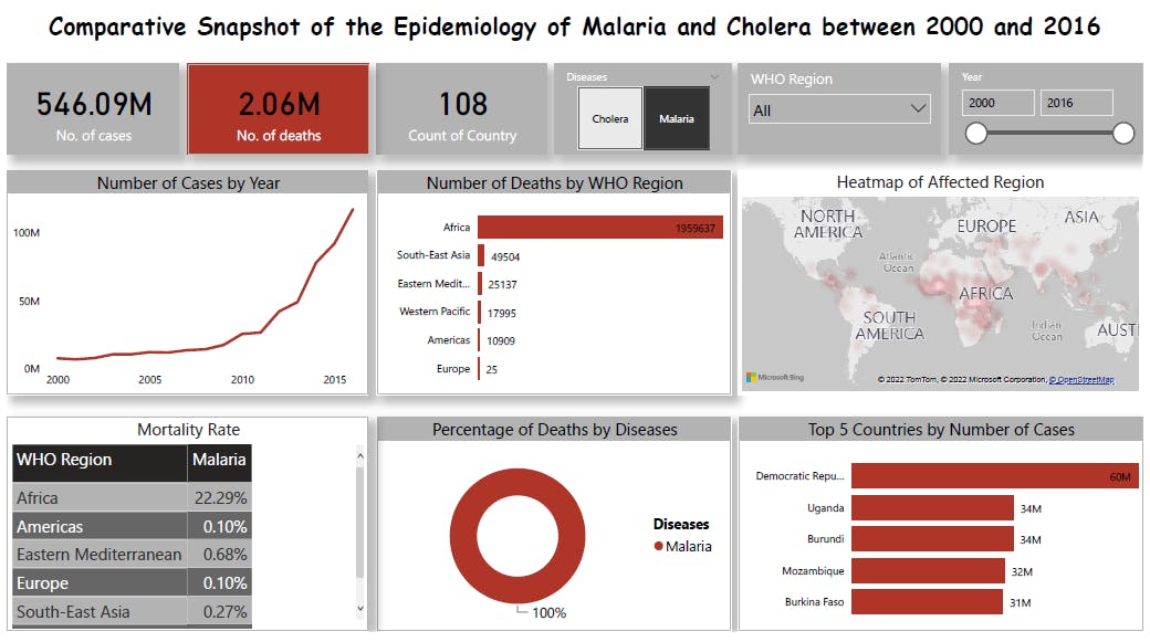
- Bookmarks were used to save each disease by filtering the slicer, in order to view the insights of each disease separately.
An interactive dashboard was built but snapshots were taken for upload for the purpose of this write-up.
Result:
Conclusion:
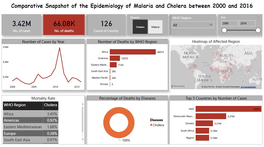
It is observed that although the life expectancy of the world has gradually increased over the years, the combined burden of these diseases did not reduce. For malaria, a surge was noticed around 2009 and the number of cases kept increasing over the years. For Cholera, a surge was noticed around the same time with a peak around 2011 and the values then crashed afterward which is a good indication.
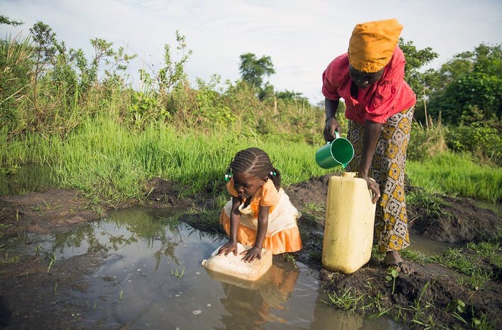
From the heatmap, it is seen that Africa remains the center of burden for these diseases and resources need to be pumped into Africa to combat these diseases.
From the donut chart, it is seen that the burden of Malaria is sufficiently higher than that of Cholera with malaria accounting for 96.9% and cholera only 3.1% in the combined study.
Africa has the highest number of deaths amounting to "2,007,652" compared to other WHO Regions. For Malaria, the Democratic Republic of the Congo has the highest number of cases amounting to over a 60million cases over the time period. Other counties toping this ill chart are Uganda, Burundi, Mozambique, and Burkina Faso. For Cholera, Haiti has the highest number of Cases with about a 0.8million cases over the time period. Other counties Democratic Republic of the Congo, Somalia, South Africa, and Nigeria.
In light of this analysis, we can see that although the world is said to be altogether healthy, some countries are left out of this. One can postulate that the life expectancy will be lower in Africa and especially in these countries. These countries will benefit from health systems strengthening which involves strengthening (i) service delivery, (ii) health workforce, (iii) health information systems, (iv) access to essential medicines, (v) financing, and (vi) leadership/governance.
When this is achieved, we can thus say that global health is strengthened and no one is left out.
The 9 Analytics Team: