

Introduction:
Without a doubt, airplanes are one the best inventions, making the world feel smaller with the ability to travel large distances in shorter times compared to when we depended on horses, camels, trains, and ships, which took days, weeks, or even months to arrive at our destinations.
Airplanes have connected nations that would have never been connected and shown us a new, beautiful, and breathtaking perspective of our earth. With the help of planes, we can now move long distances for business and private reasons with planes traveling at an average speed of 700 – 900 km/h.
The aviation industry with its robust operation generates a large amount of data daily. This project aims to provide a descriptive analysis of the use of San Francisco International Airport.
Data and Model:
Data Scraping: San Francisco Airport passengers Traffic between 2005 to 2018 dataset was obtained from Kaggle. The data was imported into the power bi and then transformed into the power query.
Data Cleaning: Unwanted columns not needed for the descriptive analysis were removed and column headers were renamed.
Data Visualization:
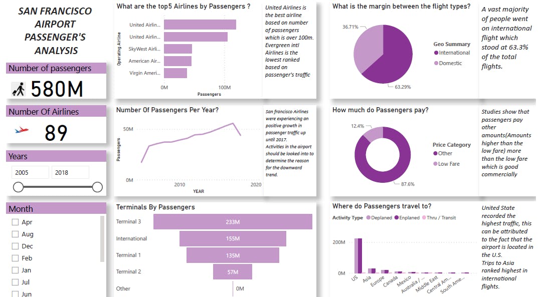
- Cards were used to show the Total Number of Passengers and Total Number of Airlines in San Francisco
- Years and Months were visualized in a slicer to use the filtering function
- A bar chart was used to visualize the top 5 Airlines by the total number of passengers
- A line chart was used to show the trend of the total number of passengers over the years
- A funnel chart was used to show the terminal with the highest number of Passengers
- A pie chart was used to show the percentages of the flight type
- A donut chart was used to show the price category by Passengers
- A column Clustered Chart was used to show the Activity type and Geo Region by Passengers
- Finally, Textboxes were used to explain key points in each chart
Result:
Conclusion:
The analysis involved a total number of 580 million passengers that traveled between 2005 and 2018 in San Francisco International Airport, having 89 airlines. The top operating airlines were United, SkyWest, American, and Virgin America Airlines with United Airlines topping the chart. It was noticed that the majority of travel were International travels having 63.29% and Domestic Travels with 36.71%.
From the line chart, it is seen that the number of travels has gradually increased from 2005 through the years but with a decline around 2017. Slicer was used to represent months and it was seen that July and August were the periods people traveled most while January and February were the months people traveled the least.
The funnel chart was used to show the travels by the terminals. Terminal 3 had the highest for Domestic, next to the International Terminal, then Terminal 1 and Terminal 2 having the least.
Enplanement and Deplanement rates were closely related while Thru/Transit was least for all locations. For international travels, Asia trips ranked the highest, followed by Europe, Canada, and others as shown in the Column chart.
From the trend, one can predict that the aviation industry would continually progress in business having more passengers from time to time. Countries that develop their capacity in this industry can sufficiently increase their GDP from this. Shareholders can project to see their shares grow if they invest in the industry and the industry can provide more jobs. Based on data and analysis, we can hypothesize that this industrial sector has come to stay and can only get better with time.